Chapter 16: Statistics
Statistics gives us tools for collecting, organizing, describing, and interpreting data. We use statistics to uncover patterns, make predictions, and support decision-making under uncertainty.
In this chapter, we introduce basic statistical vocabulary, methods for displaying data, and numerical summaries for the center, spread, and position of a data set.
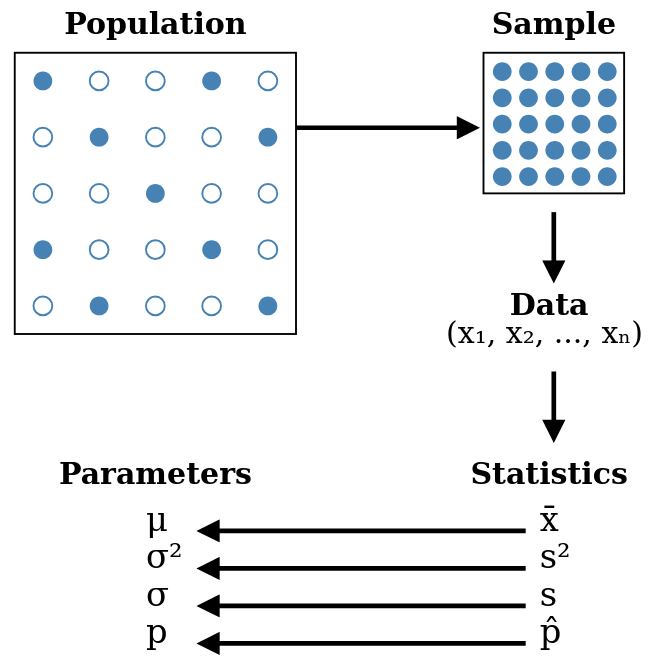
The figure previews the main idea behind statistical reasoning: we observe data from a sample, compute statistics from those data, and use them to learn about the larger population.
Populations, Samples, Parameters, and Statistics
When working with data, we usually want to say something about a larger group. The language of populations, samples, parameters, and statistics helps us distinguish between the group we care about and the data we actually observe.
These four terms come in two related pairs: population and sample describe the group being studied, while parameter and statistic describe numerical summaries.
Population. The population of a study is the entire group the collected data is intended to describe. If the population has units, we may write it as
The units may be people, objects, or events. A variable assigns a measurement or category to each unit. If a quantitative variable gives the values for the population units, then these values, rather than the units themselves, enter numerical calculations.
Sample. A sample is a smaller subset of the population, ideally one that is representative of the whole population. If the sample contains units, we often write their observed values as
where is the sample size.
Parameter. A parameter is a fixed numerical characteristic of a population. Parameters are usually denoted with Greek letters, such as the population mean
Statistic. A statistic is a value calculated from the data in a sample. Statistics are often used to estimate population parameters. For example, the sample mean
may be used to estimate the population mean .
Statistical notation often indicates the role of a quantity:
- A bar usually denotes an average. For example, is the sample mean.
- A hat usually denotes an estimate. For example, may estimate an unknown population proportion .
- Greek letters often denote population parameters, such as the population mean and standard deviation .
- Latin letters often denote sample statistics, such as the sample mean and standard deviation .
- A subscript identifies an individual value or group, as in for the th observation.
These are common conventions rather than universal rules, so each symbol should still be defined when introduced.
Suppose an online shop wants to understand the spending behavior of all customers during a year.
- The population is all customers who bought something from the shop during that year.
- A sample might be the first customers shown in this chapter.
- A parameter could be the true mean spending of all customers that year.
- A statistic could be the mean spending of the sampled customers, which we can compute from the observed data.
Populations can be made up of people, objects, events, or measurements. Examples include patients in a hospital, all cars produced by a factory in one year, books in a library, daily temperatures in a city, or earthquake occurrences worldwide.
Sampling Methods
Studying a full population is often impractical, so we choose a sample. The quality of the sample matters: a well-designed sample supports valid conclusions, while a biased sample can lead to misleading conclusions.
The following table summarizes common sampling methods.
Table 16.1. Common sampling methods and their selection rules.
| Sampling method | How the sample is selected | Main idea or concern |
|---|---|---|
| Simple random sample | Every possible sample of a fixed size has the same probability of being selected. | Treats all samples of that size symmetrically. |
| Stratified sample | The population is divided into meaningful groups, called strata, and units are sampled from each group. | Ensures important groups are represented. |
| Cluster sample | The population is divided into clusters, some clusters are randomly selected, and all units in those clusters are surveyed. | Useful when surveying units across the full population is impractical. |
| Systematic sample | A random starting point is chosen, and then every th unit is selected. | Simple to carry out, but can be biased if the ordering has a pattern. |
| Convenience sample | Data are collected from units that are easy to reach. | Often biased because easy-to-reach units may not represent the population. |
The figure below shows the same population under the different selection rules.
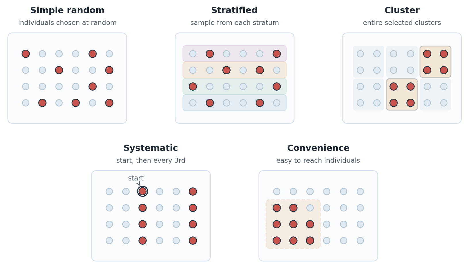
This is not an exhaustive list. Other sampling designs exist, but these are among the most common introductory examples.
Sampling bias is a systematic tendency for some parts of the population to be overrepresented or underrepresented. It makes it harder to use a sample statistic as a reliable estimate of a population parameter. Unequal selection probabilities do not by themselves imply bias if the sampling design and analysis account for them, as can happen in stratified sampling.
Categorizing Data
To compute statistics, we start with a data set organized into observations and variables. Each observation, or record, contains the information collected about one unit, such as a person or object. A variable is a characteristic measured or described for every unit, and a data value is one recorded value of one variable.
We will use the following online customer data set throughout the chapter.
Table 16.2. Online customer data used as the running example in this chapter.
| ID | Region | Product | Signup Year | Satisfaction | Purchases | Spending (EUR) |
|---|---|---|---|---|---|---|
| 1 | East | B | 2021 | 4 | 6 | 294 |
| 2 | West | A | 2019 | 3 | 8 | 380 |
| 3 | North | A | 2024 | 4 | 5 | 45 |
| 4 | East | A | 2020 | 4 | 7 | 38 |
| 5 | East | A | 2018 | 2 | 11 | 55 |
| 6 | West | B | 2022 | 2 | 8 | 224 |
| 7 | North | B | 2020 | 3 | 7 | 595 |
| 8 | North | B | 2023 | 5 | 7 | 371 |
| 9 | East | B | 2021 | 3 | 4 | 216 |
| 10 | South | A | 2019 | 2 | 10 | 125 |
| 11 | East | C | 2024 | 4 | 10 | 90 |
| 12 | East | B | 2018 | 4 | 8 | 88 |
| 13 | East | B | 2022 | 3 | 5 | 165 |
| 14 | East | A | 2023 | 4 | 6 | 207 |
| 15 | West | A | 2020 | 1 | 5 | 245 |
Variables are first divided into categorical and quantitative variables. Quantitative variables can then be described as discrete or continuous.
Categorical variable. A categorical variable, also called a qualitative variable, describes a category or characteristic. Categorical variables may be nominal or ordinal and cannot generally be added, multiplied, or averaged meaningfully.
Quantitative variable. A quantitative variable, also called a numerical variable, represents a measurable quantity numerically. Which arithmetic operations are meaningful depends on the variable's level of measurement.
Discrete quantitative variable. A discrete quantitative variable can take only specific values, often because it is counted.
Continuous quantitative variable. A continuous quantitative variable can take values across an interval, often because it is measured.
One way to connect variable types with the set-theoretic language from Chapter 1 is to ask: What set of possible values can this variable take? The level of measurement then tells us what structure those possible values have and what comparisons or calculations are meaningful.
The levels of measurement describe what kinds of comparisons or calculations are meaningful for a variable. Four common levels are nominal, ordinal, interval, and ratio.
Nominal variable. A nominal variable is a categorical variable whose categories have no natural order.
Ordinal variable. An ordinal variable is a categorical variable whose categories have a natural order, but the differences between neighboring categories are not necessarily equal.
For interval and ratio variables, equal differences are meaningful: a change of the same number of units represents the same amount of change anywhere on the scale. The key difference is whether division comparisons are meaningful.
Interval variable. An interval variable is quantitative. Differences are meaningful, so it makes sense to subtract two values. However, the zero point is chosen as part of the scale. If the zero point were moved, the differences between values would stay the same, but division comparisons would change. Therefore, interval variables are compared by differences, not by statements such as "twice as large."
Ratio variable. A ratio variable is quantitative. Its zero point is fixed by the quantity itself, so measurements are counted from that starting point. Differences are meaningful, and division comparisons are meaningful too. This means we can say both "how much more" and "how many times as large."
The difference between interval and ratio variables is therefore a question about what comparisons the scale supports. Interval variables support subtraction. Ratio variables support both subtraction and division.
The variables in the customer data can be classified using the two systems introduced above: variable type and measurement level.
The variables in the customer data can also be classified by looking at their possible values. Categorical variables use sets of labels or categories, while quantitative variables use numerical values. Some numerical values are separated, such as counts, while others are modeled on intervals of the real number line.
A useful way to decide the measurement level is to ask what statements are meaningful. Can we only name groups? Can we put values in order? Can we subtract values? Can we divide one value by another and interpret the result as "how many times as large"?
The table below pairs each visual summary with the reason for the classification shown in the illustration.
Table 16.3. Classification and justification of the customer variables.
| Variable categorization | Explanation |
|---|---|
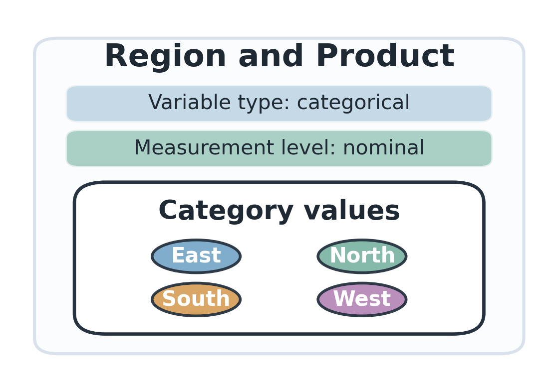 | Region and Product are names of groups. A customer can be in the East region or have product A, but those labels are not numerical amounts. We can count how many customers are in each group, but the groups have no natural order. Subtraction and division comparisons are not meaningful for these labels. |
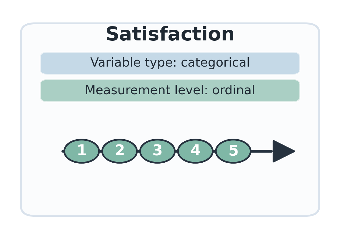 | Satisfaction uses the ordered ratings . The order is meaningful: means more satisfied than , and means more satisfied than . The exact distance between neighboring ratings is not guaranteed to be the same, so the safest interpretation is an ordinal categorical variable, not a quantitative measurement. |
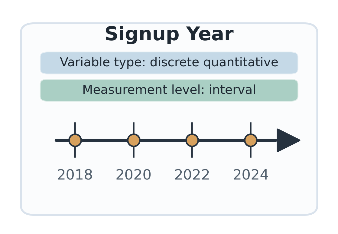 | Signup Year is recorded in whole years, such as . Subtraction is meaningful: , so a customer who signed up in signed up years after one who signed up in . Division comparisons are not meaningful for calendar-year labels. The statement " is twice " only compares labels on the calendar scale; it does not say something useful about signup time. |
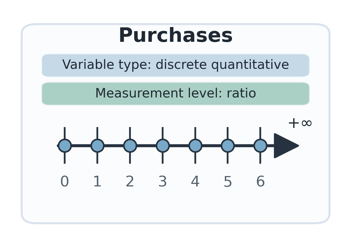 | Purchases is a count, so the values are non-negative integers. Subtraction is meaningful: purchases is more than purchases. Division is meaningful too: , so purchases is twice as many as purchases. |
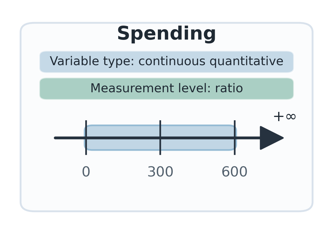 | Spending is an amount of money. It is treated as continuous because money is measured on a scale, even if the table rounds to whole euros. Subtraction is meaningful: EUR is EUR more than EUR . Division is meaningful too: , so EUR is twice as much spending as EUR . |
The later numerical summaries focus mainly on Purchases and Spending.
Presenting Data Graphically
Once data are collected, one of the most effective ways to summarize them is with graphs. The type of graph we choose depends on the type of data:
- Categorical data are often summarized using bar charts.
- Quantitative data are often summarized using histograms.
Before creating graphs, we often organize the data into a frequency distribution.
Frequency. Frequency is the number of times a data value, category, or interval occurs.
Relative frequency. Relative frequency is the frequency divided by the sample size . It describes the proportion of the data represented by that value, category, or interval.
If a category or bin has frequency , then its relative frequency is
When relative frequency is reported as a percentage, we multiply by :
The next example uses the Spending column to show how values can be grouped into intervals and converted from frequencies to relative frequencies.
Using EUR 100 intervals, the Spending column can be summarized as follows:
Table 16.4. Frequency and relative-frequency distribution for spending values.
| Spending bin (EUR) | Frequency | Values | Relative frequency |
|---|---|---|---|
| 0-99 | 5 | 38, 45, 55, 88, 90 | |
| 100-199 | 2 | 125, 165 | |
| 200-299 | 5 | 207, 216, 224, 245, 294 | |
| 300-399 | 2 | 371, 380 | |
| 400-499 | 0 | -- | |
| 500-599 | 1 | 595 |
In the spending table, of the customers have spending values between EUR 0 and EUR 99. The relative frequency of this bin is therefore
This means that about one third of the sampled customers are in the lowest spending bin.
A bar chart displays one bar for each category. The height or length of each bar indicates the frequency or relative frequency of that category.
The categorical variables Region and Product can be summarized using bar charts. Since the values are categories, the important comparison is the height of the bars rather than the order of the category names.
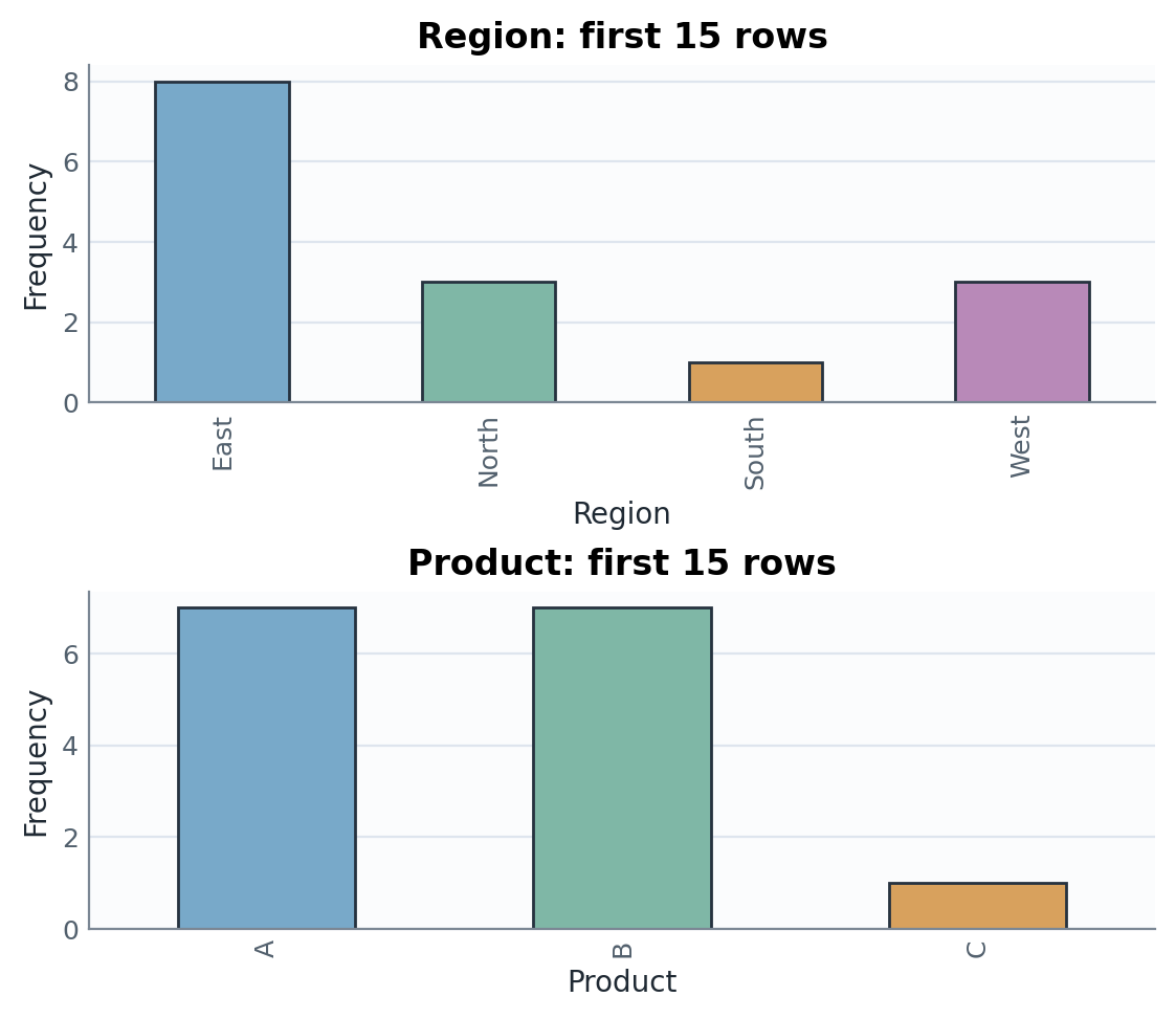
In this sample, East is the most common region. For Product, categories A and B occur equally often, while C occurs only once.
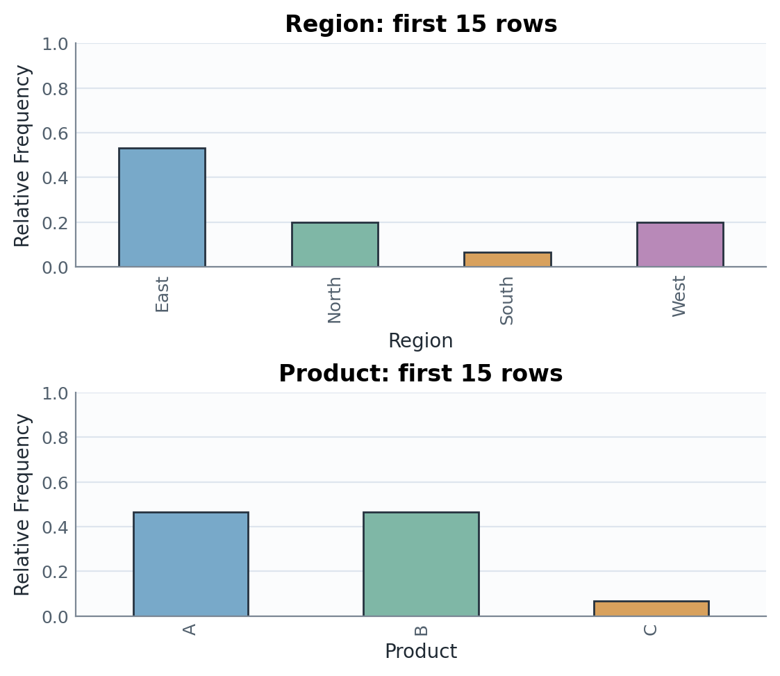
The relative-frequency charts show the same pattern, but the vertical scale is converted from counts to proportions.
A histogram groups numerical data into adjacent intervals, called bins. Its bars can show frequency or relative frequency. To prevent a boundary value from entering two bins, intervals may be written as half-open intervals such as and ; the final interval can include its right endpoint.
The quantitative variables Purchases and Spending can be summarized using histograms. Here the horizontal scale has numerical meaning, so the shape of the bars tells us how the values are distributed. The ordinal variable Satisfaction should instead be summarized with an ordered bar chart because the ratings are ordered categories.
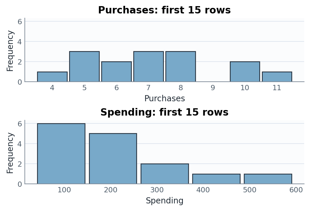
The spending histogram has a longer right tail than the purchases histogram: most spending values are below EUR 300, but a few customers spend more.
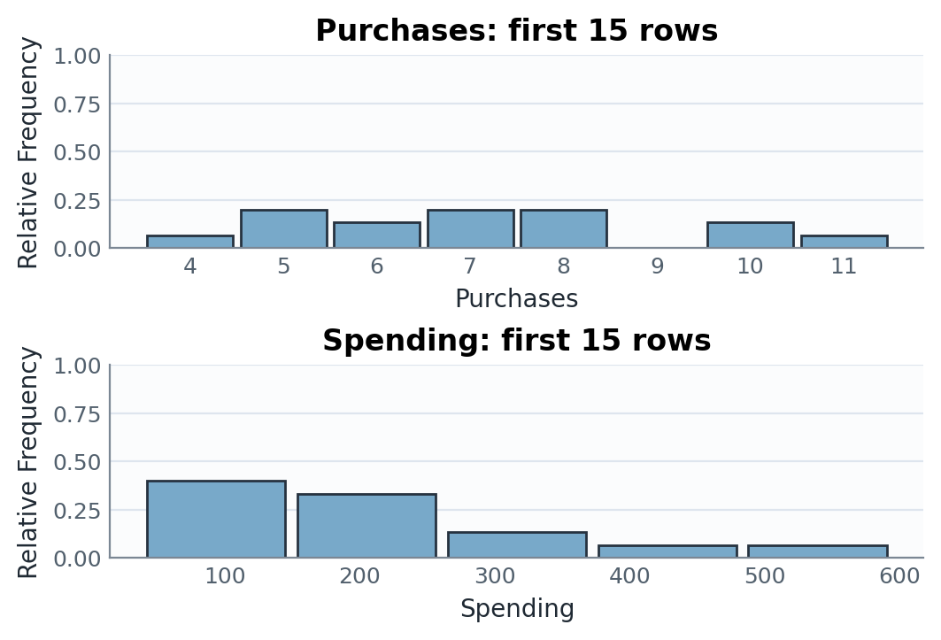
As with bar charts, changing from frequency to relative frequency changes the vertical scale but not the overall shape. For this fixed sample of customers, the frequency and relative-frequency versions contain the same information for each variable: the relative-frequency version divides each count by . This becomes useful when comparing histograms based on samples of different sizes, because the bars are then measured on the same proportion scale.
The look of a histogram depends on both the sample size and the bin width. A small sample size can make a histogram unstable, while a large sample size often reveals a smoother shape. Wide bins give fewer bars and less detail; narrow bins give more detail but can look noisy if the sample is small.
The following grid shows how the same variable can appear differently when the sample size or bin width changes.
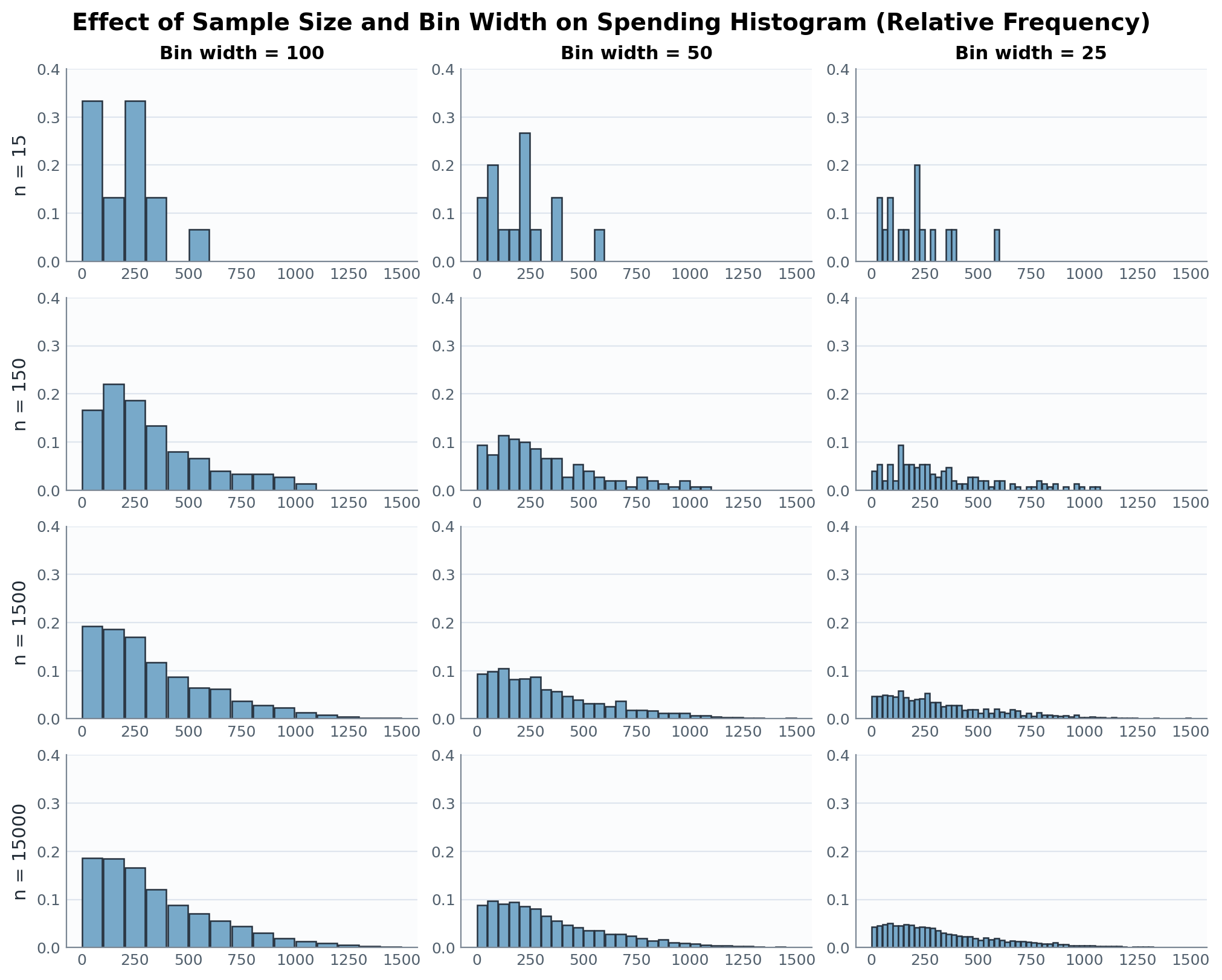
Across each row, narrower bins reveal more detail but can make the histogram look more irregular. Down each column, larger samples make the right-skewed shape easier to recognize.
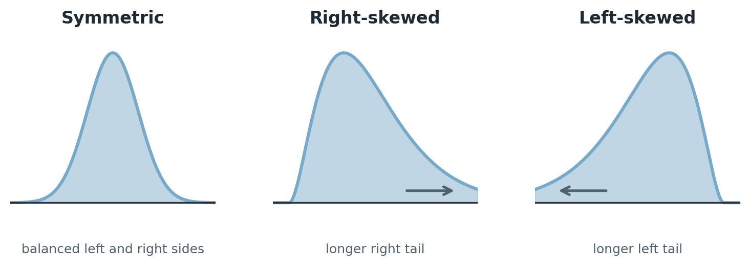
Histograms help us describe the overall shape of a quantitative distribution. One important shape feature is whether the distribution is roughly balanced or whether it has a longer tail on one side.
A symmetric distribution has left and right sides that are roughly balanced around the center.
A right-skewed distribution, also called a positively skewed distribution, has a longer tail to the right. This means that a few relatively large values stretch the distribution toward larger numbers.
A left-skewed distribution, also called a negatively skewed distribution, has a longer tail to the left. This means that a few relatively small values stretch the distribution toward smaller numbers.
Skewness matters because the mean is pulled toward the longer tail, while the median is usually less affected by extreme values.
Measures of Central Tendency
Quantitative data can be described not only verbally and graphically, but also with numbers. When summarizing a distribution, we often want to know:
- a representative value, or center, and
- how spread out the data values are.
In this section, we focus on measures of central tendency: the mean, median, and mode.
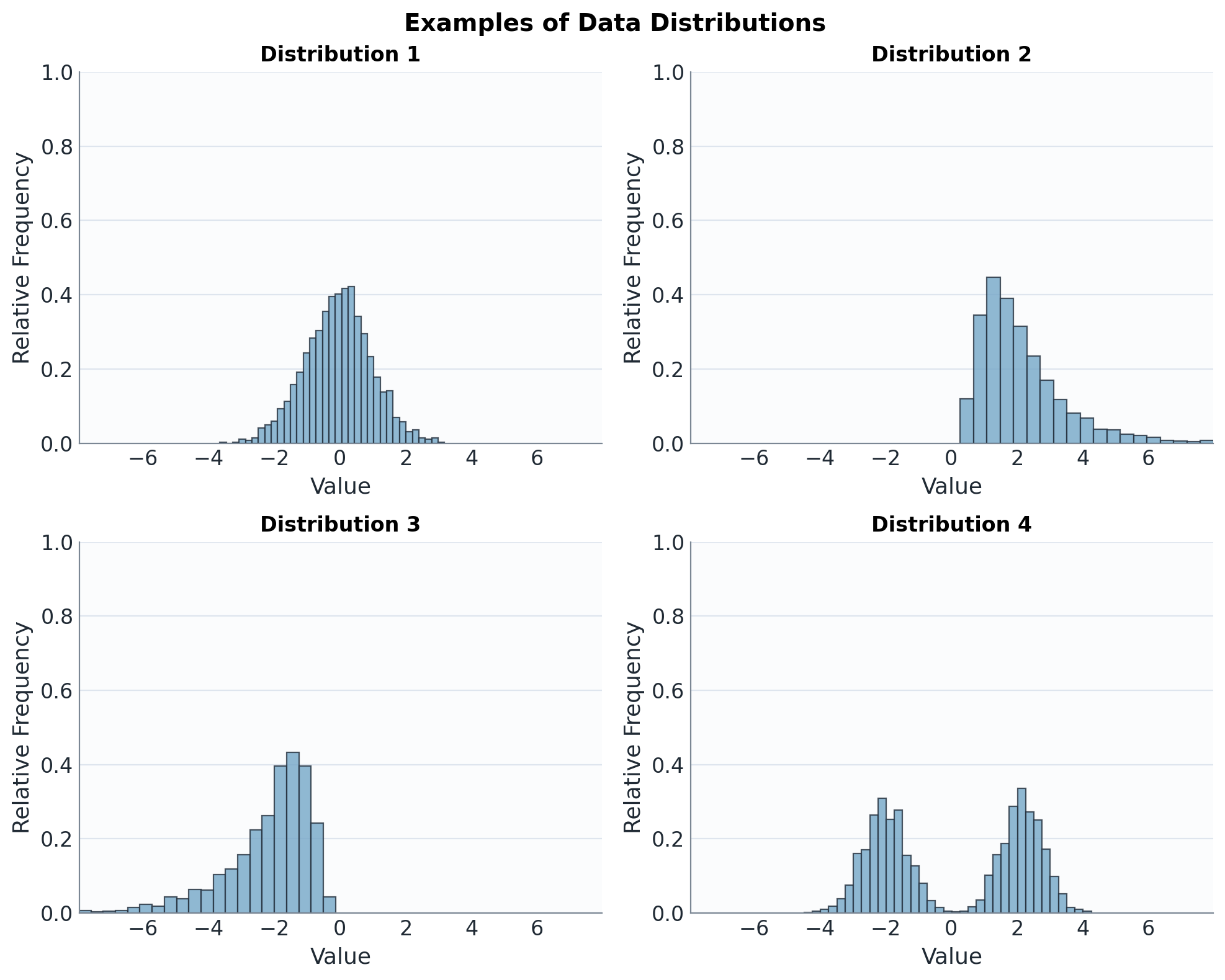
We will use these four distributions repeatedly. This makes it easier to see how different summaries respond to symmetry, skewness, and multiple peaks.
Mean
The arithmetic mean, often simply called the mean, is found by dividing the sum of the data values by the number of values.
For data values , the sample mean is
Here, is the th data value, is the sample size, and is read as "x bar."
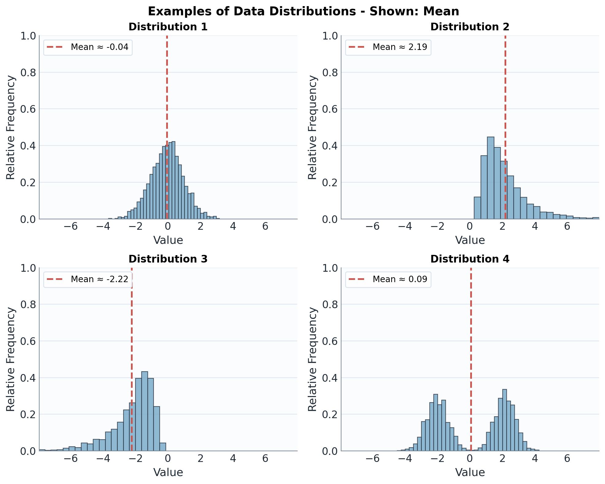
The mean marks a balance point of the distribution. In skewed distributions, this balance point is pulled toward the longer tail.
For the first 15 customers, the spending values are
The mean spending is
The mean spending is EUR 209.20.
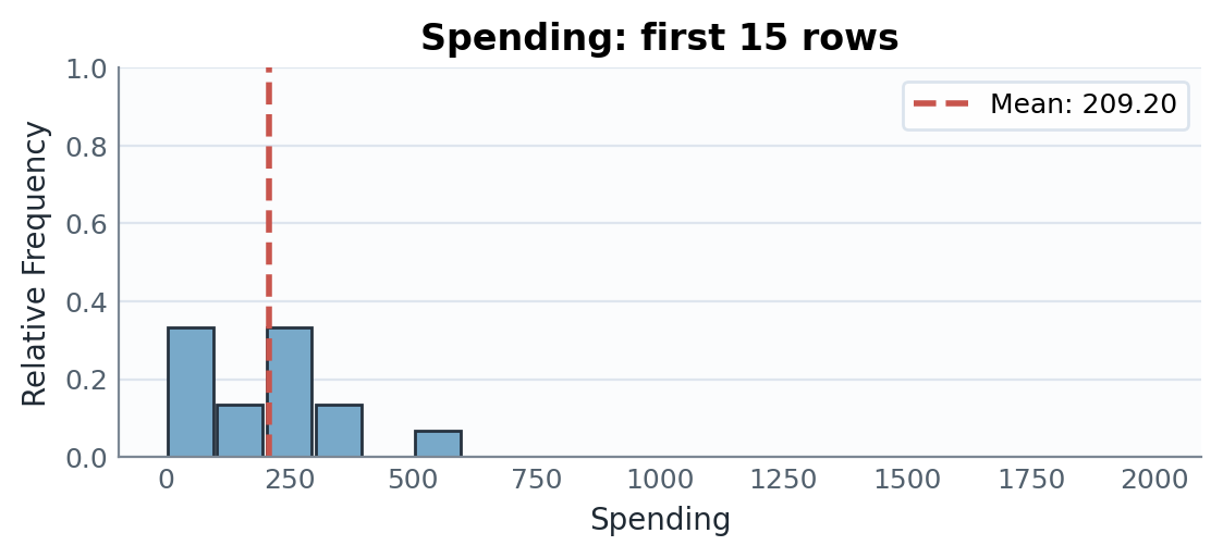
The mean lies near the center of the main cluster, but it is slightly pulled toward the larger spending values.
Outliers
Outliers are especially important when interpreting measures of center.
An outlier is a value much higher or lower than the rest of the data. Outliers may represent unusual but valid behavior, or they may be data entry errors.
Suppose a new customer spends EUR 2000. Including this value, the data set now has values and the mean becomes
The mean is now about EUR 321.13. While this is mathematically correct, it no longer represents a typical customer very well because the outlier has pulled the mean upward.
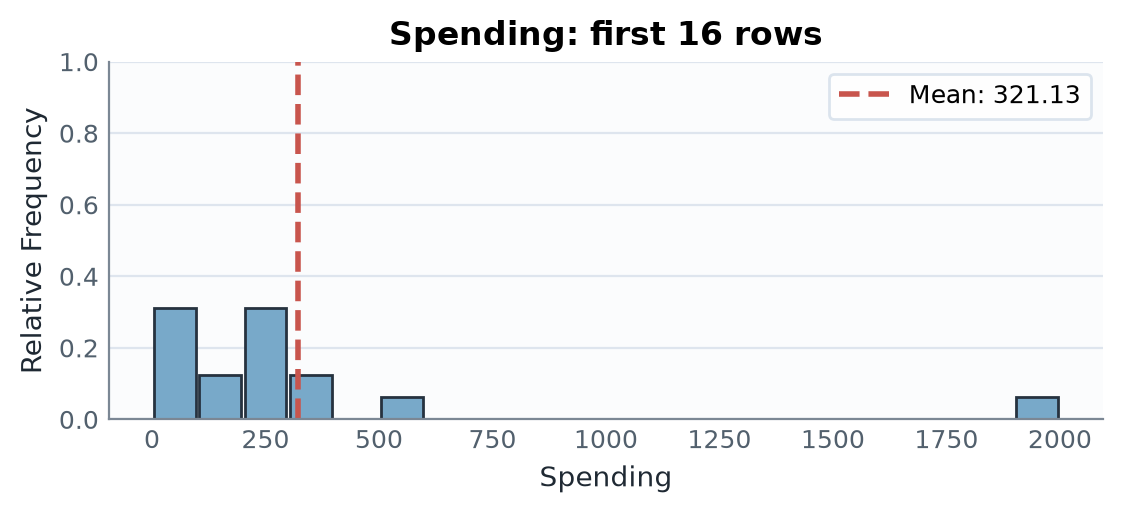
Compared with the previous plot, the mean marker moves far to the right even though all the original data values are unchanged.
When outliers are present, another measure of center is often more useful: the median.
Median
The median is the middle value of an ordered data set.
To find the median:
- Order the data values from smallest to largest.
- If there is an odd number of values, the middle value is the median.
- If there is an even number of values, the median is the mean of the two middle values.
If the ordered data values are
then the median is
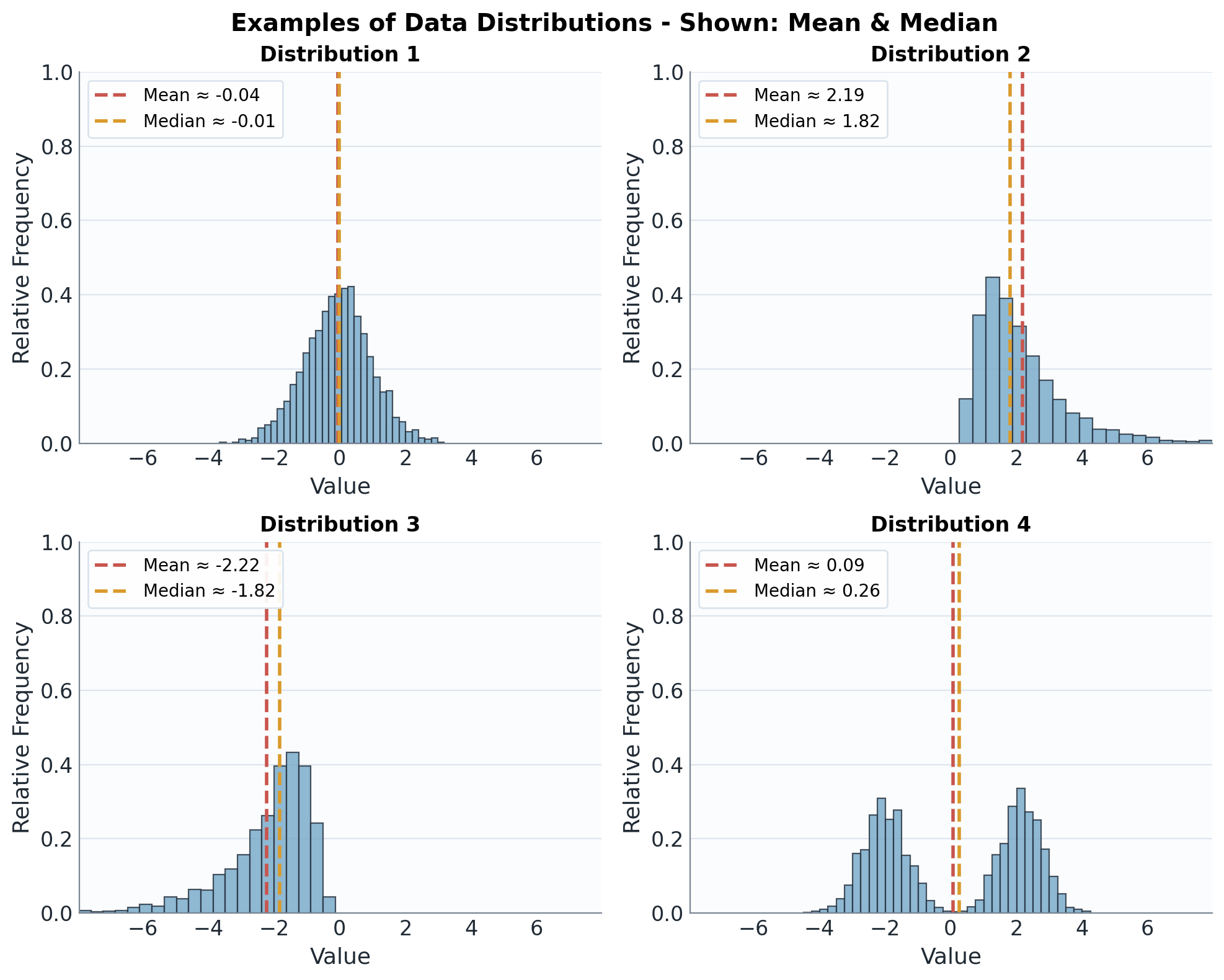
When a distribution is roughly symmetric, the mean and median tend to be close. When a distribution is skewed, the mean is usually pulled farther toward the tail than the median.
Including the EUR 2000 outlier, the sorted spending values are
There are data values, so the median is the mean of the two middle values:
Notice that the median remains close to the original center of the data, even with the outlier.
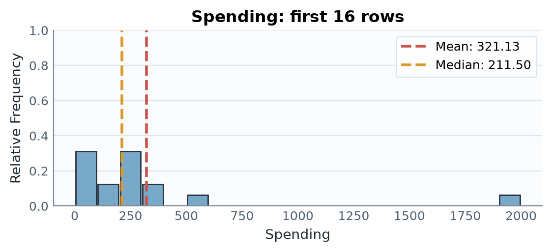
The plot illustrates why the median is resistant to this outlier: it still depends only on the two middle ordered values.
Mode
The mode is the data value or category that occurs most frequently in a data set.
The value with the largest frequency is always a formal maximizer in a finite data set. In this book, if every value occurs equally often, we say that the data set has no reported mode because no value is more frequent than the others. Otherwise, a data set may have one mode (unimodal), two modes (bimodal), or more than two modes (multimodal).
For grouped data, the modal class is the bin or interval containing the largest number of values.
If denotes the frequency of the value or category , then a mode is any value satisfying
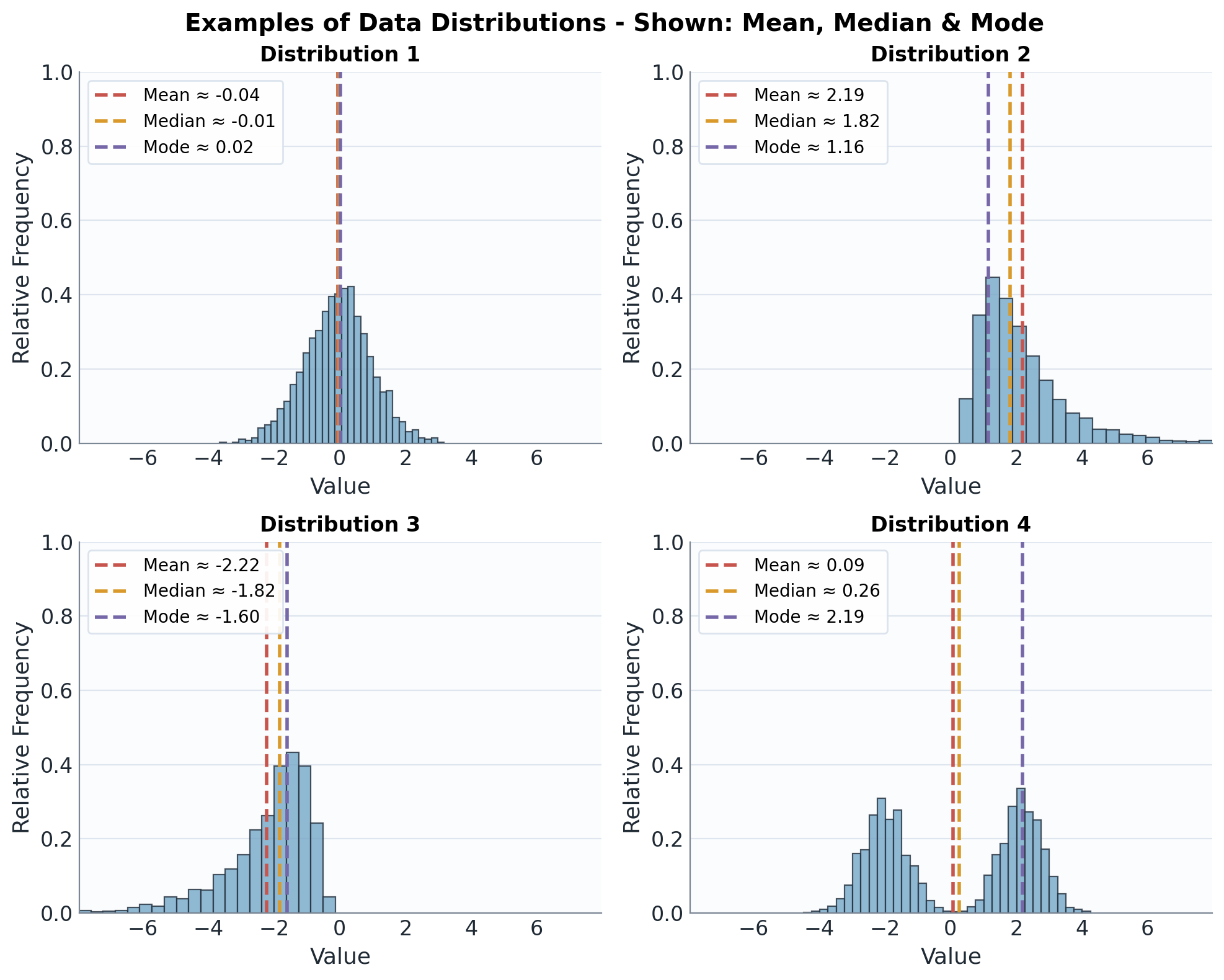
The mode identifies where the distribution is most concentrated. It can agree with the mean and median in a symmetric distribution, but in skewed or multi-peaked distributions it may tell a different story.
After grouping data into bins, we report a modal class rather than a single modal value: the bin with the largest count.
In the spending frequency table above, the bins EUR 0-99 and EUR 200-299 both have frequency , the highest frequency. Therefore, the grouped spending data have two modal classes: EUR 0-99 and EUR 200-299.
Measures of Spread
Consider three lists of quiz scores on a 10-point quiz:
- Class A:
- Class B:
- Class C:
All three data sets have mean and median , yet the distributions are clearly different. Measures of spread help describe this variation.
Range
The first and simplest way to measure spread is the range.
The range is the difference between the maximum value and the minimum value of a data set:
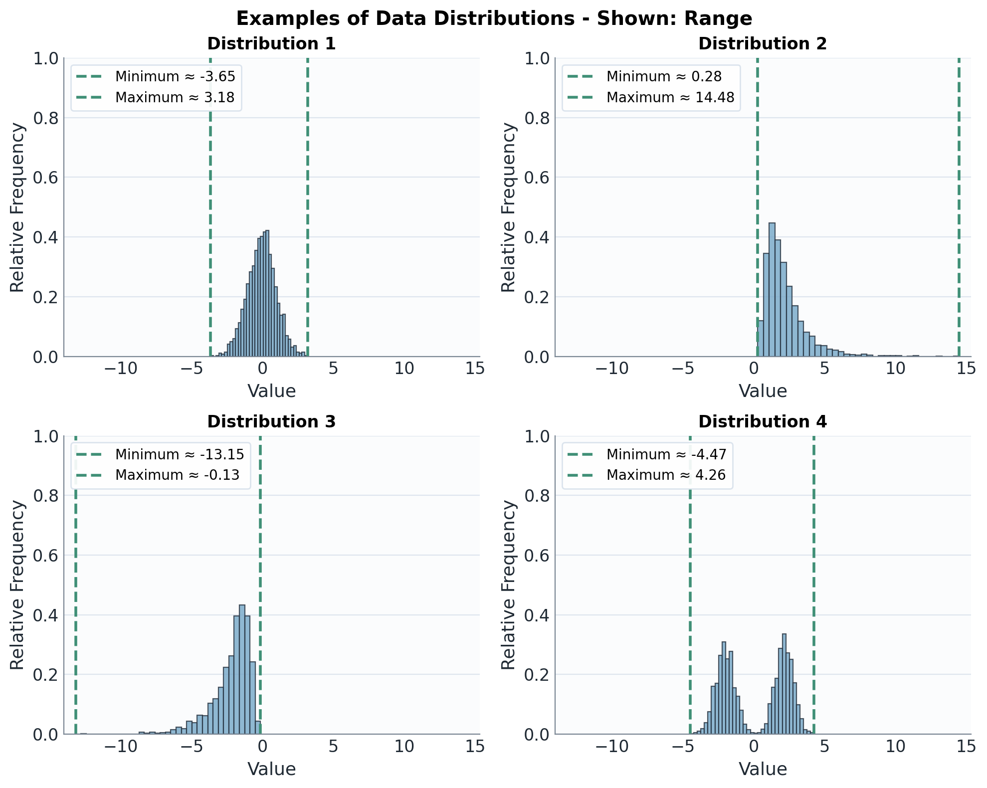
The range uses only the two endpoints. In the plots above, long tails stretch the range even when most of the data are concentrated in a much smaller interval.
For the original 15 customer spending values, the minimum is and the maximum is . Therefore,
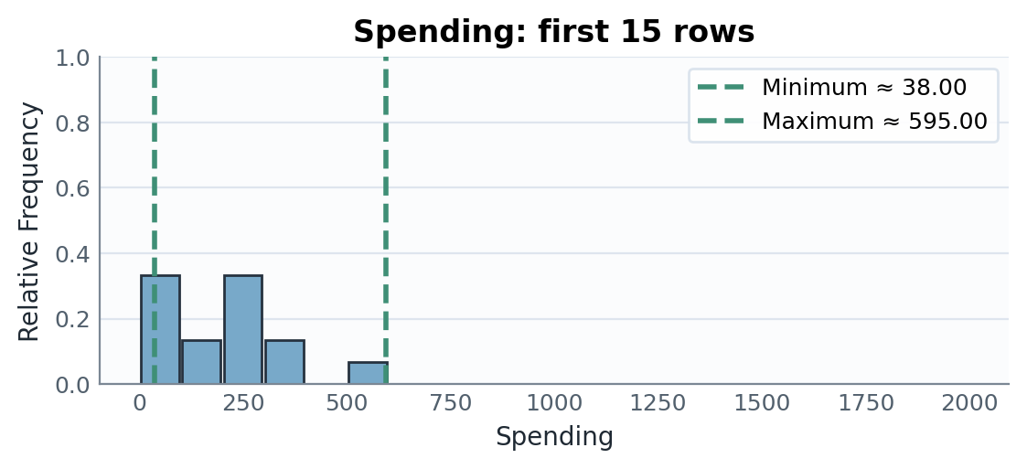
Most of the data values are much lower than EUR 595, but the range is determined entirely by the minimum and maximum.
The range only considers the extremes and ignores all the values between them. For example, the data sets
and
both have range , but their spreads are very different.
Deviation, Variance, and Standard Deviation
The difference between a data value and the mean is called the deviation from the mean:
Positive deviations indicate values above the mean, and negative deviations indicate values below the mean. The sum of all deviations is always zero apart from small rounding errors, because positive and negative deviations cancel out.
For the original 15 spending values, :
Table 16.5. Deviations from the mean and squared deviations for spending values.
| Spending | Deviation | Squared deviation |
|---|---|---|
| 294 | 84.8 | 7191.04 |
| 380 | 170.8 | 29172.64 |
| 45 | -164.2 | 26961.64 |
| 38 | -171.2 | 29309.44 |
| 55 | -154.2 | 23777.64 |
| 224 | 14.8 | 219.04 |
| 595 | 385.8 | 148841.64 |
| 371 | 161.8 | 26179.24 |
| 216 | 6.8 | 46.24 |
| 125 | -84.2 | 7089.64 |
| 90 | -119.2 | 14208.64 |
| 88 | -121.2 | 14689.44 |
| 165 | -44.2 | 1953.64 |
| 207 | -2.2 | 4.84 |
| 245 | 35.8 | 1281.64 |
| Sum | 330926.40 |
For a sample containing values, the sample variance is the sum of the squared deviations from the mean divided by :
The divisor is used because the deviations are calculated from the sample mean: once deviations are known, the final deviation is determined by the requirement that they sum to zero. This adjustment makes suitable for estimating population variance.
Variance is measured in squared units, which makes it less intuitive. The standard deviation takes the square root of the variance, returning the measure of spread to the original units.
For a sample containing values, the sample standard deviation is
It measures the typical distance of the data values from the mean.
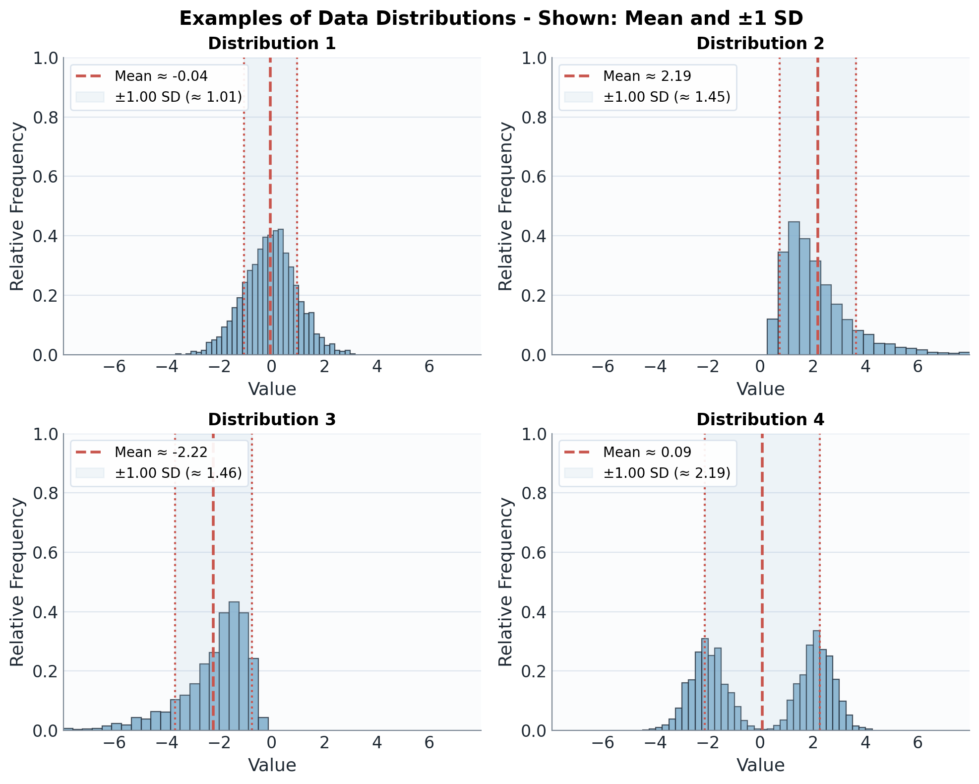
The shaded interval shows one standard deviation on each side of the mean. Wider shaded intervals indicate greater typical variation around the mean.
For the original spending values, the table above gives
The sample variance is
The sample standard deviation is
Thus, the spending values are typically about EUR 153.75 away from the mean.
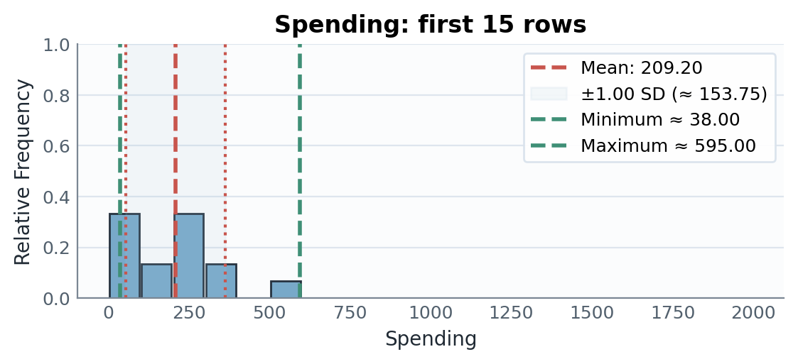
The standard deviation gives a more typical spread around the mean than the full range, because the range is driven only by the smallest and largest spending values.
Measures of Position
Percentiles and Quartiles
The th percentile is a value that places approximately of the ordered data at or below it. Percentiles describe relative position within a data set.
Percentiles describe position. For example, a value at the 80th percentile is interpreted as placing approximately 80% of the data at or below it and approximately 20% above it.
There are several accepted rules for calculating percentiles, and statistical software may interpolate between ordered values in different ways. Consequently, two methods can give slightly different answers for a small data set. In this chapter, quartiles are calculated with the median-of-halves method below.
Quartiles are common percentiles that split a data set into four parts:
- is the first quartile, or 25th percentile.
- is the second quartile, or 50th percentile. This is the median.
- is the third quartile, or 75th percentile.
In percentile notation,
To find quartiles:
- Order the data from smallest to largest.
- Find the median, .
- If the data set has an odd number of values, exclude the overall median before forming the lower and upper halves. If it has an even number of values, divide it into two halves of equal size.
- Find the median of the lower half of the data; this is .
- Find the median of the upper half of the data; this is .
For the sorted spending values
the median is . Using the lower and upper halves of the data,
Thus, the middle half of the spending values lies between EUR 88 and EUR 294.
Five-Number Summary and IQR
The five-number summary is:
The interquartile range (IQR) measures the spread of the middle 50% of the data:
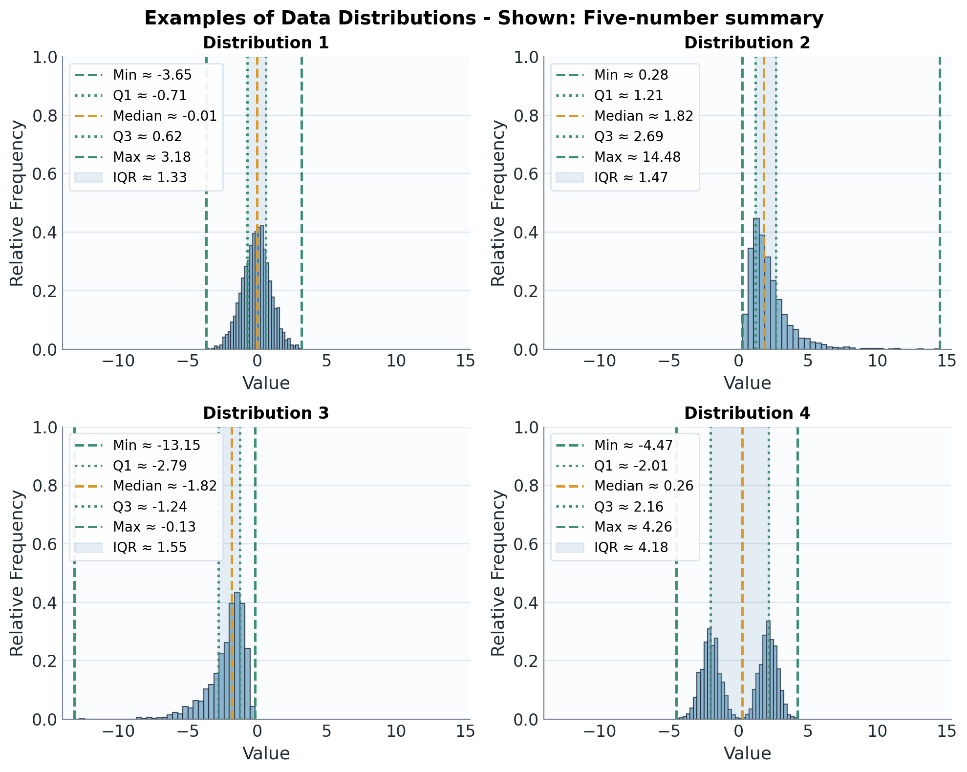
The five-number summary combines the endpoints with the quartiles. The shaded IQR focuses on the middle half of the data and is less affected by extreme values than the full range.
Now that the quartiles are known, we can collect the endpoints and quartiles into one compact summary.
The sorted spending values are
The five-number summary is:
- Minimum:
- :
- Median:
- :
- Maximum:
The interquartile range is
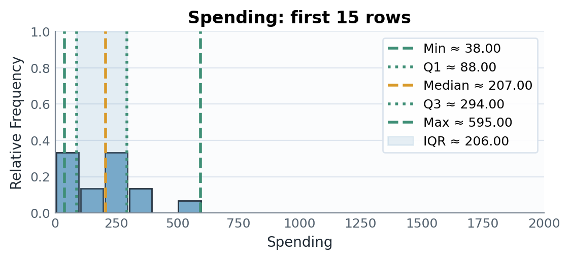
The marked values show that the central 50% of sampled customers spent between EUR 88 and EUR 294, while the maximum EUR 595 creates a longer upper tail.
Box-and-Whisker Plots
A box plot, or box-and-whisker plot, is a graphical representation of the five-number summary.
In a box plot:
- the box spans from to ,
- a line inside the box marks the median,
- whiskers extend to the most extreme values that are not treated as outliers, and
- separate symbols may be used to mark potential outliers.
If no data values are shown separately as outliers, the whiskers extend to the minimum and maximum.
A box plot shows the center of the data, the spread of the data, and possible skewness or outliers.
A common rule marks data values as potential outliers if they lie below the lower fence or above the upper fence:
For the original spending data, the box extends from to , and the median line is at . The whiskers extend to the minimum and maximum .
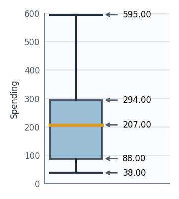
The box represents the IQR, so it contains the middle 50% of the data values. The longer upper whisker suggests that the higher spending values are more spread out than the lower spending values.
Since , the lower and upper fences are
and
The maximum value is below the upper fence, so this rule does not mark any of the original spending values as a potential outlier.
Now return to the EUR 2000 customer used in the mean and median examples. With this value included, the quartiles become , median , and , so
The upper fence is
Since EUR 2000 is above the upper fence, the box plot marks it separately as a potential outlier. The upper whisker stops at EUR 595, the largest spending value that is not treated as an outlier by this rule.
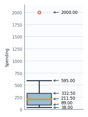
Compared with the original box plot, the box and median move only slightly, while the separate point makes the outlier visible immediately.